Saturday, November 27, 2010

TEUTON #2; Page Ten

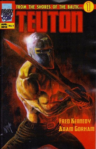
I'm still hard at work on issue two of Teuton and I'd say for the most part it's gone fairly well. Page Ten, however, has been a thorn in my side the past few days.

The Fearless One and I work pretty well together, I must say. Because we're indie and live relatively near one another, we're able to meet and hash out our scripts and layouts over a long afternoon of coffee and 80's action flicks. Not all creative teams have the luxury of face-to-face discussion, but at this point I can't imagine working with someone long distance. I digress.

After our meeting I go on to refine my roughs at home. There's a very good process I've been taught to make going from thumbnails to full-board an easy transition. My problem is I don't often practice it. Shame on me, I know. Consider this post a cautionary tale, because the aforementioned page ten would not have been so painstaking if I had been a diligent little comic book artist and stuck to my learnings.

When Fred and I discussed the action beats for issue two, of which there are many, he sets up this skirmish with Jadvyga and undead skeletal warriors. It all takes place on a single page and Fred wanted emphasis on a panel where Jadvyga brings his axe down on one of these skeletal guys in a powerful way. To have have the character fight he first had to leap off his horse. And since we didn't establish his axe in the previous pages I'd have to do it somewhere between his leaping and his fight. Then I got lost in all the many ways I could show Jadvyga hacking guys up with an axe. There were so many bad ass images in my brain that I had trouble letting them go. What's more, I had trouble making them all fit.

Like I said, there was one specific image Fred wanted to dominate the page, and the more I jammed in there the less room there was to meet Fred's needs. I loved the panel where Jadvyga smiles fiendishly at his attackers, or where he gives one of them a swift kick in the face. Those were good. They worked. What didn't work were the panels in between the action shots. They made the page static and slowed the momentum of the fight. Y'see to tell an action sequence effectively you have to economize your characters' movements by choosing concise moments in time and space. Drawing lots of panels with bodies or limbs in motion slows time down and kills your end result. All of that connective tissue between action shots happens in the gutter. A reader processes that information when they jump from panel to panel. I forgot that and consequently pooched my page.


I had made a thumbnail of the page and simply tried drawing it straight to the board. Maybe I was trying to save time. In the end I cost myself more than I'd care to admit. Working on the blank page from scratch, I abandoned my original layout and it was downhill from there. I re-drew it several times before finally saying fuck it and just began inking. I inked a panel and then drew another one without forethought. If it popped into my brain it went down on the page. Drafting was out the window. When I finally broke away from the page I saw what a mess I had gotten myself into. I showed it to Fred and I could tell he wasn't feeling my revisions. Call it freewheelin', but I basically pulled the layout out of my ass. So I gave myself the time to do again and do it right.

What you see is the final version of page ten from issue two, as well as the preceding page 9. Enjoy them. There's more to come!


Wednesday, November 17, 2010

New Comic Book Day 11.17.2010 - BATMAN!

I was only compelled to buy three of the many comics that went on sale today. Two of them are Batman titles. This comes as no personal surprise because I'm a rabid Bat-fan. Moreover, I've been closely following Grant Morrison's sprawling Bat-Odyssey every step of the way. Last week saw the final installment of The Return or Bruce Wayne, which was also the final chapter on a much larger over-arching story. Exciting times!

While you can argue that Morrison's run on his numerous bat-titles haven't been perfect, there's no denying that his meticulously plotted stories have been a challenging and compelling read that not only breathed new life into long forgotten cannon, but also reinvigorated the Bat-Mythos for future stories. I believe for every reader of Batman--or any major character otherwise--there are passages in the characters history they'd prefer not to acknowledge. As we build our collections we pick and choose what events mattered and which we turn a blind eye to. With Morrison's run, however, I was tasked as a reader to delve into earlier eras of Batman's long continuity to uncover the roots of stories like Batman and Son, or R.I.P., and even Return of Bruce Wayne. Stuff I wouldn't normally have enjoyed or been aware of became significant in a contemporary fashion. It was an immersive experience and I thoroughly enjoyed the ride.

Now a new chapter begins within the pages of Batman: The Return (a one-shot) and Batman Incorporated (new on-going series), both of which I was at first skeptical of. Undoubtedly the new direction seemed like a bold one (a Batman in every country), but like so many long-time readers I was wary of change. First of all, the title Batman Inc. sounded a little tacky. The concept is not a completely original one, although it has not be thoroughly explored, and so I wondered how Incorporated would fit alongside everything that has come before it. With Return I was cagey about David Finch's art. Finch is a legitimate superstar in comics and for good reason. His heavy, gritty style has elements of a 90's Todd Mcfarlane and carries--in this issue particularly--a similar moody and horrific quality as Bernie Wrightson. My problems with Finch's artwork fall with his proportions and his tendency to make his characters too weathered and grisled. Fortunately both titles surpassed my expectations.


BATMAN: The Return

In Return, Finch's art proved a fine fit for the script. I was mesmerized by the opening pages where Morrison brilliantly gives a poignant back story to the Bat that inspired Bruce Wayne to become Batman. I have wondered before, "why would a large bat randomly crash through a window?" It's a small detail in the scheme of things but I loved it that it's been addressed. With the climax of The Return of Bruce Wayne still fresh in my mind, the issue follows Bruce on his curiously foreboding "to-do" list. Throughout the issue I was reminded of obscure future visions seen in Batman #'s 666 and 700, and the fact Bruce had a glimpse of things to come while at the outpost at the end of all time. Also in this one-shot there's a new ominous villain and allusions of their nefarious winner-take-all plan. With dark and terrible forces over the horizon, Bruce Wayne goes on the offensive and tirelessly takes steps to prepare himself and the Bat-Family, who are unaware of what's coming. Part of this plan involves recruiting a Batman in every major city on the planet. It is then he appoints Dick the Batman of Gotham and permits Damien to stay on as Robin. The book ends with the perfect lead into Batman Incorporated...


BATMAN INCORPORATED

This title was a whole whack of fun. I truly do believe that artist Yanick Paquette made this book come together. His energetic, Kevin Nowlan inspired drawing style feels fresh and yet familiar in the world of Batman. After being blown away by his Pirate-Batman entry in The Return of Bruce Wayne, I very much wanted to see him on Batman and Robin. As fun as that sounded, his art in Incorporated is just so exciting. Grant Morrison revels in introducing new heroes from other parts of the globe, something he did incredibly well with the International Bat-men in his Black Glove arc earlier on. In this book we are brought to Japan as Batman looks to recruit Mr. Uknown. Little does Bats know, a ruthless villain by the name of Lord Death Man has sinister plans for the local Japanese hero. What I especially love about this first issue is Yanick's character designs for everyone in this book. Batman's suit is tactical, functional, reminiscent of the Christopher Nolan films. Lord Death Man, who steals the show along with his henchmen, are a celebration of the 60's Bat-Manga craze and all its camp. I also really enjoyed the relationship between Batman and Catwoman, which in this book is fun, exciting and frothing with sexual tension which I am positive gets released somewhere in the gutter. This book takes on the tone of the successful Nolan films and the style of James Bond, which makes for a solid first issue and I cannot wait for more. Whatever Grant Morrison has in store for Batman and his readers, I'll be there with bells on.

Monday, November 15, 2010

Around the Interwebs

Here's are some fun links that are associated with me either directly or indirectly. In other words, I had too much time on my hands this afternoon. Enjoy!

Art Libs by Stephanie Cooke
Steph is a rad lady who enjoys exploring new art. Art Libs is her innovative Q&A that brings to light artists and their works so her many readers can dig on them too. Isn't she the greatest? She was kind enough to feature me twice and you can read both articles: Art Libs Q&A, Art Libs Fan Expo 2010 Coverage

Cerebus TV: My Video Interview at the 2010 Toronto Wizard Convention


 Convention sketches from early 2010: Comic Art Gallery

An assortment of my Bios on various comic sites
Praise and Articles for Holmes Inc.  

Praise and Articles for Big Sexy Comics


Praise and Articles for The Vampire Conspiracy: The Zed Word Blog review


Sunday, November 14, 2010

TEUTON Issue Two

There's no denying it's been a very long time since my last update. Truth be told, so much time has passed that I almost forgot I started this blog. That being said, it's high time I reveal what I've been up to!

What now feels like an eternity ago I began my career in comics with the self-published book, The Vampire Conspiracy. Along with writer/director Marc Morgenstern, we launched the 120+ page OGN at the 2009 Toronto Fan Expo. What a time that was! Reaching that point was extremely important for me. Illustrating the book took about nine months, and during that period there were many sleepless nights where completion seemed impossible, my will to finish waned, and the idea of being a professional artist seemed unrealistic. Secretly I felt inadequate for the task at hand and would often be paralyzed in fear before a blank page. Nights would go by without much being done because of all that, and ever present was the sound of a ticking clock. Indeed, before landing the gig on TVC, I had only ever completed eight sequential pages one long ago summer. Suddenly I was charged with completing a staggering one hundred twenty pages--plus a cover! Was I up to the task? Well, yes, as it turned out, despite my troubling neuroses.

Like I said, completing the book was a big step for me personally. It takes a lot of discipline to finish any project and at that point I lacked any discipline whatsoever. Consequently, the book garnered some attention from other indie creators at my level of skill and experience--people just taking a stab at telling stories in comics with ambitions of moving on to grander things. I was lucky enough to meet many wonderful writers and artists, some of whom I've even had the privilege of working with. Chief among them are McHozer Comics, an indie imprint based in Mississauga for which I did an uncompleted short story titled To Whom It May Concern. I've also done work for a talented writer by the name of Phil McClorey who spins his own brand of pulpy horror with his imprint Furious Comics. My collaboration with Phil can be read in his Book of Methuselah #4; an eight page short called Quork. I think you'll dig it.

While doing these shorts, however, I had a constant craving for telling long form stories, or full issues in a series. I wanted my name on something big, bad and bold. As luck would have it, the opportunity to work on such a book was given to me by none other than Fearless Fred of 102.1 The Edge. Fred had recently moved to Toronto to start his new gig at The Edge, and one of the many goals he had upon settling in was to establish his own brand of comics. Little did he know I would be here to welcome him with open arms.

I loved Fred's antics on his afternoon broadcast. When I heard him mention his love of comics I decided to contact him about checking out The Vampire Conspiracy. In truth it was shameless self promotion, but that same afternoon he surprised me with a job offer: art chores on a Medieval epic about the knights of the Teutonic Holy Order. The guy was just so plainly cool I almost wanted to poke him to be sure he was real. Very modestly he shared with me his story idea and his vision of a brand called Big Sexy Comics. You see he had this story in mind that pits mortal men against a pantheon of gods that was yet untapped in comic books, or so we think. So Fred welcomed me to BSC, and together we created Teuton. Nearly a year after starting work on book, we launched the title and the brand at the 2010 Toronto Fan Expo, a convention that attendees will remember as an unholy cluster-fuck of greed and comic book geekery.

I encourage you to read the entire first issue of Teuton for free at www.bigsexycomics.com

During the time it took to complete my big, bad comic I did a very smart thing and enrolled myself in the Toronto Cartoonists Workshop. Dear Reader, if you have any interest or aspirations to create in the field of comics, I highly recommend checking out the TCW. Under the tutelage of Ty Templeton, I learned the fundamentals of storytelling in comics, as well as the ins and outs of the business itself. Investing myself in the TCW's programs sharpened my skills beyond what they were merely months before.

Not long after finishing my program at the school I was contacted by the faculty to participate in their first ever publication. The aim was to showcase students who advanced in the TCW's numerous programs, as well as to promote the school itself. Thus Holmes Inc was created: conceived and edited by Ty Templeton and featuring original stories written and drawn by TCW alumni. I worked on a story called The Fingerless Prince with scribe Heather Emme, and it was an absolute blast to draw. That 52-page giant issue was also launched at 2010 Fan Expo.

There, I think we are pretty much caught up. Currently I am working steadfast on the second issue of Teuton, which will be available online for free by December. I promise to post some sneak peeks soon!

Until next time...